
Don Watch: flood-response digital twin
A live flood twin of Sheffield's River Don that runs entirely in the browser, on the visitor's own GPU. Real terrain, real Environment Agency gauge data, a WebGPU water simulation, and a team of on-device AI agents reasoning over it as the water rises. Pull the network cable and nothing stops.
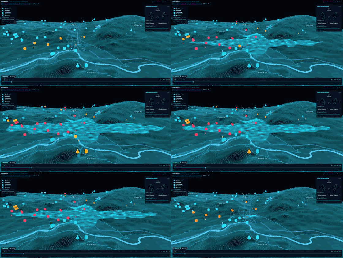
Sheffield floods. The Don came over its banks in November 2019, and the maths that governs it is no mystery. So the question I set myself wasn't whether you could model it. It was how much of the whole thing you could put inside a browser tab and still have it feel like a serious tool rather than a tech demo.
Don Watch is the answer. It rebuilds the Don valley from open LIDAR elevation, drapes the real river over it, and replays the November 2019 flood hour by hour from the Environment Agency's own gauge records. The water you watch rise is the water that rose in 2019. A live mode swaps the replay for the EA's current flood-monitoring feed, so the same twin runs against today.
Everything on the device
The part I care about most is where the work happens. The terrain, the water and the bloom run on the GPU through WebGPU, shaded in TSL. The AI runs there too, an open model loaded straight into the browser through WebLLM, on the visitor's own hardware. No server, no API key, nothing leaving the machine. There's a button marked "cut the network". Press it mid-demo and nothing stops, because the model is already cached on disk and the flood is driven by data that came down with the page.
That constraint is the whole point. Plenty of "AI flood tools" are a thin front end sat in front of somebody else's cloud. This one has no back end at all. It ships as a static site and installs as a progressive web app, so it runs on a locked-down laptop or in a field office with no signal.
Agents that show their working
Five agents work the flood while it plays. An orchestrator hands the job out and four specialists take a piece each: two ingest agents read the gauge and rainfall figures, a forecast agent projects the level ahead, a risk agent ranks the sites in the water's path, and a comms agent drafts the plain-language brief a duty officer would actually send. Every step shows up on the map and in a live reasoning feed.
I was careful about the division of labour. The numbers, the hydrology and the risk thresholds, are deterministic TypeScript. The model doesn't invent them. It reads the results, works out what matters, and writes it up. That's the honest place for a language model in a safety-adjacent tool, and it's why the whole thing is framed as a decision-support projection, not an official flood warning. The real warnings come from the Environment Agency, and the app says so.
What's on the map
On top of the water sit the layers you'd want in a real operations picture. The EA's official flood-warning areas for the Don, Sheaf and Porter Brook are draped on the ground and light up by severity when a warning is in force. The live river-level and rainfall gauges show their current readings. Care homes, schools, hospitals, substations and riverside businesses are coloured by how close the water is to each one, so the consequence of the rise reads at a glance. Every layer toggles on and off.
The data is public and cited in the app: gauge and rainfall from the Environment Agency, the river and landmarks from OpenStreetMap, the terrain from open elevation data. Nothing is fabricated, and where a series is reconstructed it says so.
It was built to prove a point about what a browser and a modern GPU can carry between them. It ended up being the flood tool I wish more of them were.